maps

Kids Count

KidsCountLogo.jpg

The Annie E. Casey Foundation just released their 22nd annual Kids Count Data Book and now have their data available online through the Kids Count Data Center. "Kids Count is a national and state-by-state effort to track the status of children in the U.S. The Foundation provides policymakers and citizens with benchmarks of child well-being and seeks to to enrich local, state, and national discussions concerning ways to secure better futures for all children." With the online tool users can compare individual states or look at indicators across states for comparison and rank and then download the data in charts and maps for presentations. The statistics cover all of what you would expect but you will also find unique factors represented for a complete overview of children's well-being. Research includes information on children's:

  • demographics with info on immigrant families
  • education including test scores
  • family structure
  • health with insurance, dental, even mental health stats
  • safety with stats on out of home placement

Megaregion Research

Megaregion_US.jpg

Megaregions are massive interconnected cities scattered throughout the United States, e.g. the Houston/Austin/Dallas Triangle, and the America 2050 initiative is putting them under the microscope (metaphorically speaking). Their about page says, “America 2050 is a national initiative to meet the infrastructure, economic development and environmental challenges of the nation as we prepare to add about 130 million additional Americans by the year 2050.”

If you’re doing business research- especially research concentrated around megaregions- then their site is a veritable goldmine of information.  America 2050 features free reports on topics ranging from energy & climate, high speed rail, broadband infrastructure, commuter patterns, etc.

Beyond the sheer concentration of data and analysis packed in America 2050's content, their maps are an excellent highlight.  The main maps page features many versions of the national-level megaregion concentrations, plus proposed passenger transit lines throughout the US.

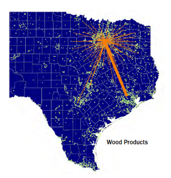
Furthermore the incredibly detailed region-specific reports found in the Research tab have maps illustrating economic interrelationships among cities, e.g. wood products’ traffic concentrations within the Texas Triangle.

For those who want to keep abreast of the major economic, environmental, infrastructure and transportation trends that are shaping America’s most heavily populated and trafficked areas, this site is definitely one to bookmark.

Newspaper Map

newspapermap.jpg

Check out Newspaper Map from Great Name. The map includes over 10,000 online newspapers from all over the world. And, most of the maps can be translated, so get the scoop straight from the local newspaper. The easiest way to navigate is  to enter the name of a newspaper in the search-box. If you don't know the name of the paper, you can zoom into the location with a double click of the mouse. Click on a marker and then select your language of choice, and the local newspaper pops up in a new window.

Casual Friday: Austin Margaritas in Google Fusion Tables

Austin-Margarita-Ratings.jpg

Amy Rushing, Metadata Librarian extraordinaire,  shows bizologie how to put Google Fusion Tables to good use. Amy has spent two years testing margaritas around Austin and rating them. Using Google Fusion she has given us Margarita Ratings: Austin, Texas - a map of restaurants and their margarita rating. You can see her rating scale in the File>About section of the Table. With Google Fusion you can create charts, graphs, and all sorts of different visualizations including maps. And, you don't have to be a metadata librarian to do it. It's easy. To create a map, make a spreadsheet with the data in Excel or Google Docs. One of the columns has to be address with zip code to map the locations. Amy used HTML code to create to the stars and fractions for her ratings. Then just import the spreadsheet into Google Fusion.

Google Fusion Table

Let us know if you are inspired to use Google Fusion to map your passion. We'd love to see your masterpiece. And, Amy, we here at bizologie commend you and hope you continue your good work.

Who's in that zipcode?

esri_metropolitans.jpg

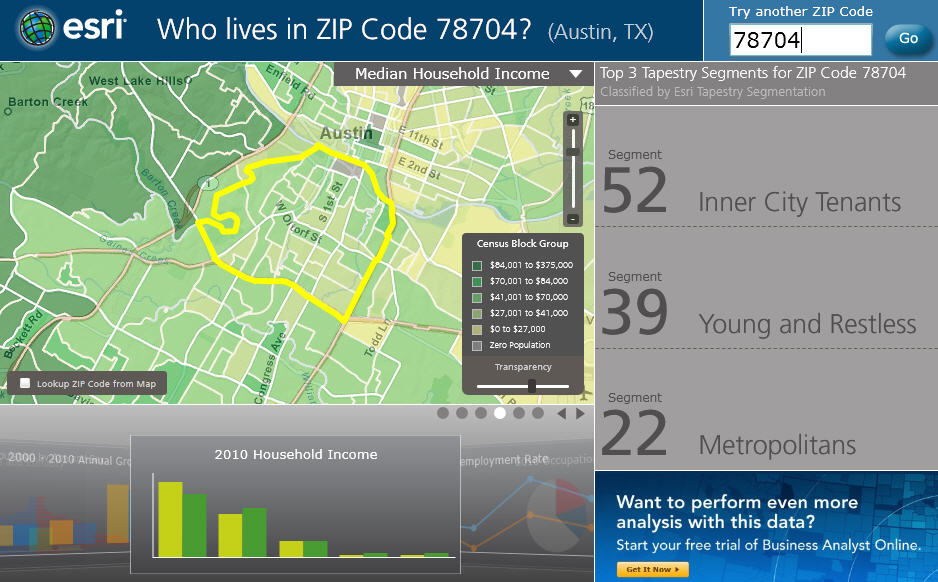
Free psychographic data down to the zip code level? It must be  your lucky day. ESRI is a leader in GIS software helping people map and visualize data. They offer a wide range of products. With a zip code search ESRI provides the usual demographics (population by age and gender, household income, unemployment rate) and then to tease you and give you a taste of what they can offer, you get the top 3 neighborhood tapestry segmentations - for free! How does the 78704 zip code shake out? Well, it's made up of the Inner City Tenants, Young and Restless, and Metropolitans. The Metropolitans' medial age is 37.6, they own or lease a station wagon, listen to NPR, and have educational loans.

esri 78704 demographics

Change your world view

FedexMaps1.jpg

FedEx has created an amazing maps site that shows how different data shapes the world. The maps actually morph on the screen. The countries change in size relative to the data represented so you get a visual representation of how much impact the information has on on each country. You can see the Exports by country for 2008, then watch as the map changes to show labor productivity, and then see the map morph into how the world looks based on predicted exports for 2030.  It also has maps that represent data on energy sources, education, access to information through different media streams, happiness index of counties, and even couch potatoes (physical inactivity along with TV and beer imports). The maps are interactive and allow scroll over so you can see the actual numbers for each country.

Some interesting tidbits:

  • Iceland might actually be the happiest place on earth
  • China recycles the most paper
  • 80% of Qatar's population works overseas

But, it's not the factoids that make the site so cool, it is watching the maps change and seeing the comparisons in country size based on the data. It's addictive. These maps would be an excellent addition to a presentation. The data is gathered from different government agencies and all sourced  by the Economist Intelligence Unit.

This video map represents forest cover for the world: